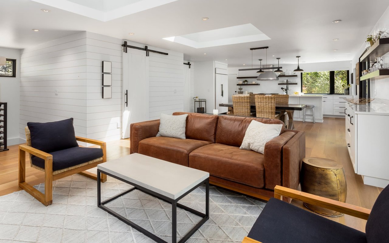
This article has been taken from Better Homes & Gardens from author Deb Schwartz, a reliable source for Homes, Gardens, and everything in between. If you’d like more information on how to makeover a small space, please visit the linked website.
Designer Shannon Claire Smith knows the challenges of
small space living. Faced with a dated 750-square-foot Washington, D.C., condo, she used paint and smart furniture choices to transform it into a glamorous retreat. (Only the bathroom underwent a full renovation.) Her tips for making this one-bedroom look and live larger than it is can be applied to any small space. We drew on lessons learned from Smith's interior designs to answer reader questions on making the most of tight quarters.
1. Make Your Room Seem Larger
Smith painted the built-ins blue-black. "Dark colors are counterintuitive," she says. "A lot of people think they make a space feel smaller, but they really make the ceiling feel higher and the room appear larger."
Black window casings also draw eyes out, making a space seem larger. White shades trimmed in black retain the effect, even when closed.
2. Go Big on Seating
A low-back sectional actually takes up less space than a sofa and chair would and accommodates her tall husband, Nick Herman. She pushed it right up to the built-ins, leaving just enough room to open the cabinet doors.
3. Simplify Silhouettes
Furniture with simple shapes and strong lines, like the
round coffee table, keep a space from feeling cluttered. The table's open brass base has a light visual footprint, and its curves are easy to navigate.
4. Build Continuity
A
decorating scheme that flows room to room is key in a small space, where multiple rooms are often visible at a glance. Smith achieved flow with a limited, mostly neutral palette that gets depth and interest from varied shades: whites and ivories, charcoals and grays, navy blues and blacks. She restricted metal finishes to matte black and antiqued brass. Because the front door opens directly into the main room, Smith positioned the dining and console tables to designate a foyer, which ends at the dresser that she stocks like a bar.
5. Use Mirrors
Smith wanted to preserve the illusion of space that the existing
mirrored wall created. However, it lacked character, so she installed a grid of molding over it. Seams in the mirror determined the molding placement, and industrial-strength contractor's glue holds the off-the-shelf pieces in place. Hanging art on a mirrored wall creates even more visual depth.
6. Store Smarter
Smith replaced a bulky yet shallow upper cabinet and short glass shelves with deep wood shelves that hold more. A tile backsplash in a c
lassic running bond pattern adds timeless appeal.
7. Use Dead Space
A
picture ledge from IKEA turns the space above a shallow counter into a place to display art, store spices, and hang mugs or utensils.
8. Camouflage It
9. Add Drama With Paint
Smith's
two-tone wall delivers instant style and creates a sense of architecture in a boxy room. The
neutral color combo serves as a versatile background that she punches up with accents in warm metals and dusty rose (a throw and artwork).
10. Create Focal Points
Architectural elements, like box molding on the walls, plus a bold ceiling light and a
statement headboard, give a room flair. Smith styles the bedside table in layers, starting by leaning a mirror against the wall to anchor the vignette and frame a small painting. Clustering small items gives them greater impact.
11. Create an Illusion
Smith
painted the ceiling black in the bathroom because "dark colors are like the night sky—you don't really know where it ends and it makes the room feel wider and taller."
12. Use Every Inch
Open shelves fill a previously empty spot above the toilet to put regularly used items in reach. A
round mirror breaks up straight lines and amplifies light.
13. Unify Surfaces
For space-enhancing uniformity, Smith chose white for the large ceramic tiles lining the bathroom walls and the small hexagonal tiles covering the floor. Bonus:
Tile is easy to clean, and dark gray grout hides dirt.
14. Build in Storage
Pedestal sinks are often recommended for
small bathrooms, but Smith opted for a 36-inch-wide vanity with lots of storage instead. She swapped out the hardware for a custom appearance.


